Navigating the Application Layout
When you log into the application for the first time, or you are getting used to the layout of the system, this topic can help you find your way around. You can click the
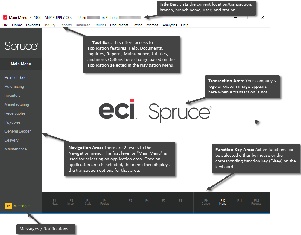
The image below shows the names and descriptions of each area of the application layout. Below that, we discuss the major areas of the application window to help you learn more.

Title Bar
At the top of the form, the Title Bar displays the name of the form you are in, the branch (store) ID, the branch name, the User ID of the person logged into the application and the Station ID area of device you are using.
Main Menu
Use the Main Menu to access the area of the software you want to work in, such as Point of Sale or Purchasing. Click the menu label to see new menu of choices and drill down into each area until you find the area you need to work in. You can learn more about all of the major application areas by selecting these links: Point of Sale, Purchasing, Inventory, Receivables,
Below menu selections, the lower portion of the navigation panel may display a messages and notifications icon. When present, users can click on the icon to open the messages form. If the icon is absent, there are no messages needing attention.
Tool Bar
Application tools (File, Home, Favorites, etc.) are accessed near the top of the form. These provide access to drop-down menus in most cases. The options presented by four of the menu strip selections: Inquiry, Reports, Database, and Utilities change based upon the selected application area (Point of Sale vs. Receivables, for example). These remain inactive until you select an application area from the Main Menu.
All remaining selections on the Tool Bar (left and right) are static and don't change based on your application, but may be different based on your permissions. Most menu selections open utility-type forms. Forms available from the Reports menu offer access to forms used for generating reports and the selections on the Inquiry menu provide access to read-only inquiry forms, for example.
Forms
There are three types of Windows forms that the application uses: transaction, utility, and dialog boxes.
Transaction
Transactions are typically required in order to conduct business operations. a specific function such as inventory receiving or point of sale, for example. In the application, the largest portion (panel) of the window is reserved for transaction forms. This area will remain empty until an activity is selected from the navigation panel. Transactions will vary depending upon function, but contain similar elements such as input fields, grids, and folders.
Utility Forms
Utility-type forms are typically accessed from the menu strip. The menu strip options: Inquiry, Reports, Database, and Utilities are transaction specific. Options found on these drop down menus usually open utility form windows which provide access to various functions in the software. Utility forms each open in a separate window. The main form (window) is the parent to all utilities forms opened. If the main form is closed, any utility type forms are also closed. The same utility form may be opened more than once, and many utility forms may remain open at the same time. Utility forms can be minimized or maximized individually as well as moved around the desktop in front of or behind other windows. Utility forms may include many of the same elements found on transaction forms such as data grids and folders.
Dialog Boxes
Dialogs are forms that are opened in a separate window from either the main application window, functions, or controls on a form. These forms typically vary in size and in some cases are displayed modally. By "modally" we mean that while displayed other application forms are disabled until the dialog is closed. Dialogs are used for processing transactions, less common maintenance tasks, and are also used to provide warnings and prompts to users. Dialogs tend to be smaller and less complex than most application or utility forms. These usually don't contain folders.
Function Keys
Function keys are listed in a panel at the bottom of the main form window. This same area displays status messages which briefly overlay the function area.