Image Lists
The Image List (Inventory > Database > Image Lists) provides a visual method for item selection in Point of Sale. The list includes between one and four organizational layers that eventually link to item images. You can add a maximum of five levels of self-defined layers (the final or last layer is always comprised of items). You can add up to five columns of lists or items to the list. There is no limit on the number of rows.
To access the Image List Maintenance form from the Main Menu, choose Inventory > Database > Image Lists.
Use the Image Lists Maintenance form to define the image list and make any changes to the image list once created. There are two types of entries used with the Image List feature: Lists and Items. Each level is comprised of either Lists or items, not both. Once you add items, you cannot add/define further levels.
Lists
Use Lists to link to additional levels to provide categorization function. Layers typically start with the most general categories and link to more and more specific classifications.
For example, you might create a list for Lumber & Building Supplies and then additional sub lists below that of Lumber, Roofing Products, and Siding as well as any others nested within those (Lumber might link to levels for Treated and so on). Lists break down to further levels that include either additional categories (lists) and eventually a final level comprised solely of items. List names must be defined from the Code Definitions > Lists tab to begin.
|
Tip! While working on defining your company's Image List, keep the Code Definitions form open so that you can easily save new list names as necessary. |
Items
Items are linked to items (usually with an image) and provide visual selection while in a transaction. Images can be associated with an item from the Images tab of the Item Maintenance form or using the Image Load utility.
Working in the Image Lists Maintenance Form
Add Control
Use the Add Control button to create a new "empty" list or item panel in the form area. Controls are added from left-to-right and top-to-bottom on the form. If you want to add controls vertically, click the Add Control button until you reach a new row. New controls are only saved if they are assigned a list name or to an inventory item, so any empty controls will be removed when you save your changes. You can save changes by clicking the links at the top of the form or by closing the form.
Images Displayed
Use this check box to specify whether the List controls display images for the current level when the Image List is being used (invoked) at Point of Sale. When images aren't displayed for lists, the panel (control) size is reduced which allows for more lists to be visible on the form at once.
It's important to understand that this won't change whether or not list images display in the Maintenance form. Images will always show in the Maintenance form if they have been associated with the list.
")
Image List: List with Image Display Disabled
")
Image List: Lists with Images
Level Links
As you navigate through the layers of the Image List, navigation links are placed at the top of the form. When the list is used at Point of Sale, these links are shown with a blue text-color and are underlined similar to a hyperlink in a document or web page. Clicking on the links navigates the user to that level. In the Maintenance form, the links are not colored or underlined, but also work the same way. In addition, the links in the maintenance form also save any changes.

Image List: Level Links
Using Row and Column Labels
As you add items and lists, you'll notice that text areas are provided along the side and across the top of the main panel. These are provided for optional labels. Labels might be used to indicate dimensions, sizes, colors, or any other attribute that might apply.

Image List Labels
Quick Points about the Image List
•There is one image list.
•The list allows up to a maximum five layers or levels of organization.
•The last or final level would include items only.
•Each list you add on the "start" level can link to it's own separate collection of additional lists, so although the number of layers is limited to five, the number of lists you can create within the layers is unlimited.
•Each level can have up to five columns (vertical) and an unlimited number of rows (horizontal).
•The list retains the last selected layer during the same application session. Due to this, maintenance changes made to products currently open in the list (while the list is in use) won't typically be reflected until either a change to the list level is made or the user signs out of the application.
•When making changes to the list, changes are saved automatically. There is no Process (F12) or save function needed. After initially adding a list, you should log-off and back on.
•Layers (aka. Levels) can only include either links to additional layers or items, not both. We intend that a list would graduate from less detail to more ending finally with a level of items for selection.
•Once any items are added to a layer, no additional levels (layers) below that level can be added. Items generally would not be added at the top level layers.
•Empty row and column labels and image panels are not saved. They must have some value in order to be saved.
•To delete an existing label or image panel, clear the text associated with the panel or text area and click the "start" link (or close the form).
•There is no limit to the number of panels you can add at any level; however, you should consider how your employees will use the list. Too many items or lists may be cumbersome.
-
Important: Although we don't limit the size of the images you add, you should avoid using high-quality images, as they tend to be too large for this purpose. Please only use images with file sizes below 200 KB. When you add a lot of large image files, it can cause the application to slow down and they introduce memory errors in some cases.
You cannot mix a "level" of lists with items. Lists can link to either other list levels or a level containing only items. Once you create an item level, no additional list or item levels can be created; however, you can rearrange levels (layers) using the Tree View (F5) function.
How do I access the Image List?
After you have created an Image List and added items to it, you can access the image list from any Item list in a data grid: right-click the down arrow of any Item list, and select the Image List option.
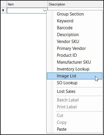
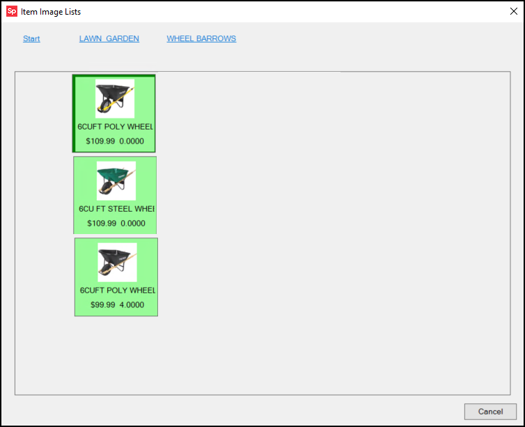
When you select this option, a form displays lists or items linked to a list.
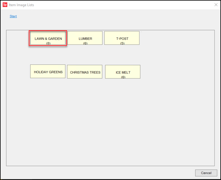
From here, you can click links to drill down the Image List to find the item you are looking for.
Once shown, you can use the image list for item selection, but you can also use it to view item images and lists even if you aren't in a transaction. You can leave the Image Lists form open between transactions and even application areas. And, even if you close the list, the application retains the last location and returns the user to it when the Image List is redisplayed (until the application is closed or you change branches). If you change branches, the data in the image list may no longer be accurate, so we close the background form.
How do I add images to a list or item?
For layers that include lists, you can drag & drop an image onto any "list" panel to associate an image with the list. A list name must be selected prior to saving. Click the "start" or current level link to save your changes.
For layers that involve items, the image must be associated with the item. This can be accomplished in a number of ways. Images can be associated with items from the Images tab on the Item Maintenance form. Images can also be loaded using the Image Load utility (available from the Inventory area). If your company uses EDI (Electronic Data Interchange) with certain vendors, we can pull item images from their catalog and associate them with items as well (this is done only upon request).
How do I create a new level for additional lists or items?
Easy, double-click on the list you want to add a new level from.
Using the Tree View (F5) Function
Click the Tree View (F5) function key to display the image list as a list with expandable nodes. The Tree View only includes list levels, not items. You can click and drag nodes to move levels from one group to another or to move it elsewhere within the same group level.