Reviewing the Scorecard Customer Dashboard (Cognytics)
The Scorecard Customer Dashboard contains seven widgets that display customer sales, returns, and payment details for a specific date range. This information is useful for understanding the business's sales status and for monitoring customer returns to assess their impact. You can also use this dashboard to review year-over-year sales and drill down into the sales accounts receivable activity for your customers. The filters in this dashboard include:
-
Date Range (Defaults to Previous Year to Date)
-
Accounts (Defaults to All)
-
Sales Representative (Defaults to All)
This dashboard is useful to Sales and Account Managers, as well as Branch and Store Managers, who need to monitor sales and returns over time and look up sales information by account. It may also be useful to Inventory Managers who need to review the quantity and types of item returns, all in one place.
Scorecard Customer Dashboard
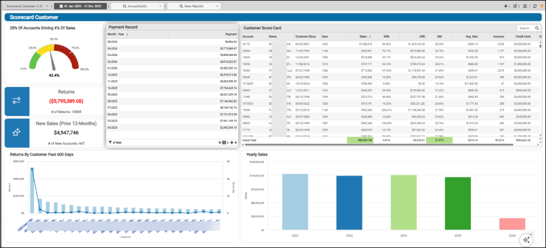
20% of Accounts Driving X% of Sales Widget (Scorecard Customer Dashboard)
Widget Name: Percent of Sales by 20 Percent Gauge v1.0
View Name: COG_VW_percentageofsalesby20percentofaccount
Historical: No
Drill-Down: None
Statistically, twenty percent of your sales account for the largest amount of income for the business, so this widget displays this calculation. The 20% of Accounts Driving X% of Sales gauge widget identifies the top 20% of accounts within the specified date range and calculates the percentage of total sales they drive.
Scorecard Customer Dashboard > 20% of Accounts Driving X% of Sales
The higher the value, the more of your sales are tied to a smaller percentage of accounts, which may pose a risk, because losing one of those customers would impact sales more. Only accounts with sales in the period appear in this calculation. In general, this sales period is the previous twelve months, including the current month and year.
For AI Insights, you might expect the following prompts for this widget:
-
Business Interpretation:
“The analysis indicates that the top 20% of your customer accounts contribute <percentage> of your total sales. This highlights a significant concentration of revenue from a core segment of your customer base within the LBM industry.” -
Potential Business Decisions:
“Implement a focused customer relationship management (CRM) strategy for the top 20% of accounts to ensure continued loyalty, explore cross-selling or up-selling opportunities, and safeguard this vital revenue stream.” -
Suggested Follow-up Questions:
“What percentage of total sales is generated by the top 10% of accounts?”
You can filter this by setting a percentage, a sales figure, a sales total, or a target sales amount.
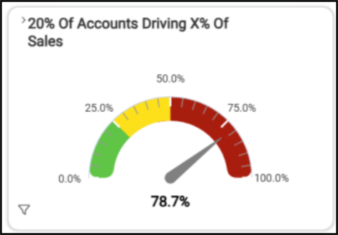
Customer Score Card Widget (Scorecard Customer Dashboard)
Widget Name: Customer Score Card v1.0
View Name: COG_VW_customerscorecard
Historical: No
Drill-Down: None
For each customer account, the Customer Score Card table widget displays the account ID and name, the customer sign-up date, their total sales for the date range, the accounts receivable amounts and percentage received, the gross margin of their sales, the average sale amount, the total number of invoices, and the account’s credit limit and percentage used. This data reflects sales over the past 12 months (the current month, next month, and the prior year). This is a rolling period, so not YTD or PYTD.
Customer Score Card Dashboard > Customer Score Card Detail
Shading (green for healthy, orange for caution, and pink for concern) highlights the Sales, Gross Margin, and Credit Percent column figures that meet specific thresholds. You can set some of these values in the filter process.
This widget displays grand totals for sales, accounts receivable, gross margin, average sale amount, total number of invoices, and total credit limit.
The AI Insights for this widget might include:
-
Business Interpretation:
"Top Performing Customers by Sales: The dataset reveals several customers contributing significantly to overall sales. Notably, <account name> has the highest recorded sales at <amount>, followed closely by <account name> with <amount>, <account name> with <amount>, and <account name> with <amount>. This indicates a concentrated revenue stream from a segment of high-value clients." -
Potential Business Decisions:
“Gross Margin Optimization Review: Conduct a deeper analysis into customers exhibiting unusually low or negative gross margins, such as <account name> or <account name>. Understand if this is due to specific product mixes, aggressive pricing, or high operational costs associated with serving these accounts, to inform pricing strategies and improve overall profitability." -
Suggested Follow-up Questions:
“Can we identify customers whose actual credit usage frequently exceeds their approved credit limits?”
You can drill down this list by account, credit balance and limit, customer class, date the account was established, costs, outstanding balances, sales representative, and user ID.
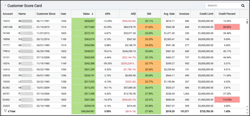
Payment Record Widget (Scorecard Customer Dashboard)
Widget Name: Payment Record v1.0
View Name: COG_VW_PaymentRecord
Historical: No
Drill-Down: None
The Payment Record table widget shows the total payments received by month over the prior 12-month period (including the current month), plus the grand total for the months displayed. These payments include both batched receivables (processed using Payment Entry) and the following payment methods:
-
Cash On Delivery (COD) payments, Received on Account payments,
-
Order deposits (positive) and Deposit refunds/payouts (these are negative),
-
Installed sales payments, when applicable, and IS payments from receivables accounts
Scorecard Customer Dashboard > Payment Record
This table excludes closed and in-progress documents, and miscellaneous payment types not tied to specific accounts.
For this widget, the following AI Insights might display:
-
Business Interpretation:
“Top Performers Analysis: Payments data for early <year> shows significant fluctuations. The highest monthly payment total was recorded in <month/year>, with approximately <amount> in payments. The single highest daily payment event occurred on <date>, bringing in an exceptional <amount>, standing out significantly from other daily figures. Other notable high-performing days include <date> (<amount>), <date> (<amount>), and <date> (<amount>).” -
Potential Business Decisions:
“Investigate the factors contributing to the exceptionally high payment on <date>, and other peak days identified. Understanding whether these were large project payments, successful major collections, or specific sales initiatives could provide valuable insights for replication or strategic planning.” -
Suggested Follow-up Questions:
“What were the specific daily payment amounts for each day in <month/year> to understand the distribution of activity within our highest performing month?“
You can filter this information by account, customer class, date, sales representative, and user IDs.
New Sales (Prior 12-Months) Widget (Scorecard Customer Dashboard)
Widget Name: New Business Total Sales v1.0
View Name: COG_VW_Newbusinessaspercentoftotal
Historical: Yes
Drill-Down: Yes (Table listing Account #, Account Name, Sales (Descending), Account Created Date, and Last Purchase Date)
The New Business Total Sales widget calculates the total new sales from new accounts and displays the number of new accounts included in the calculation. This widget uses the same view as the New Business as a Percent of Total Sales widget on the Customer Retention Dashboard, but the view is different.
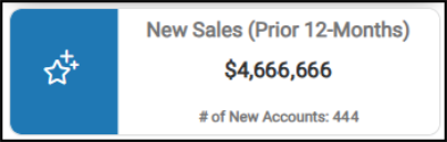
Scorecard Customer Dashboard > New Business Total Sales Chart
Returns by Customer Past 600 Days Widget
Widget Name: Returns by Customer over Past 600 days v1.0
View Name: COG_VW_ReturnsbycustomeroverPast600days
Historical: No (Fixed period)
Drill-Down: Yes (Table View and Item Details)
The Returns by Customer Past 600 Days column/bar widget contains the top 25 highest account returns for the last 600 days (in descending order). The bar setting reflects the total dollar amount of the returned items, and the dot graph reflects the quantity of items that were returned. In this case, this widget reflects returns based on the following transaction types: charge returns, sale returns, direct ship returns, and installed sales returns, where applicable.
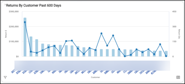
Scorecard Customer Dashboard > Returns by Customer Past 600 Days Chart
The table shows the grand totals for the per-account returns (dollar amounts) and the return item quantities.
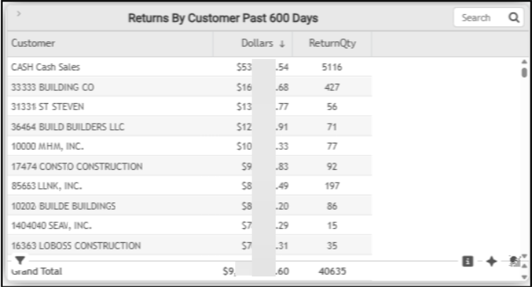
Scorecard Customer Dashboard > Returns by Customer Last 600 Days Table
The AI Insights for this type of widget might include:
-
Business Interpretation:
“<Account ID customer name> represents an exceptionally high volume of returns, totaling <amount>in value and <item quantity> in quantity over the past 600 days. This indicates a significant operational aspect for managing non-account-based returns, far exceeding any other single customer.” -
Potential Business Decisions:
“Engage proactively with key accounts exhibiting high return values, such as <account ID customer name> and <account ID customer name> . Develop tailored strategies to minimize future returns, potentially through improved project planning support, enhanced order accuracy checks, or customized material consultations to ensure the right products are selected the first time.” -
Suggested Follow-up Questions:
“What is the average dollar value per return item for each customer account, excluding cash sales, to better understand the nature of returns for specific contractors?"
You can filter this data by account information, branch information, customer class data, date the account was added, new sales as a percentage of total sales, sales representative, and user information.
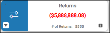
Returns Widget (Scorecard Customer Dashboard)
Widget Name: Returns v1.0 Icon Headline
View Name: COG_VW_Returns
Historical: TBD
Drill-Down: None
The Returns headline widget provides a high-level overview of the cost of item returns and the item quantity for the selected date range. Charge returns do not include returns from cash-based transactions; this widget only reflects returns from receivables accounts. Tax is not included in this value. The number of returns refers to the number of items, not the number of invoices.
Scorecard Customer Dashboard > Returns Chart
You filter this data to show account, branch, customer class, returned item descriptions, return sales document data, entry dates, invoice data, subtotals, and user records.
Yearly Sales Widget (Scorecard Customer Dashboard)
Widget Name: Yearly Sales v1.0
View Name: COG_VW_yearlysales
Historical: No
Drill-Down: Yes (Table, Date, Sales Total)
The Yearly Sales bar chart widget shows the total sales by year for the last five years, including the current year.
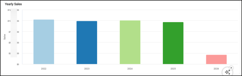
Scorecard Customer Dashboard > Yearly Sales Chart
The table associated with this chart lists the total sales for each year and the grand total of all sales for the last five years (including the current year).
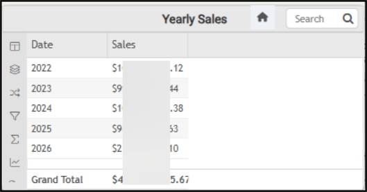
Scorecard Customer Dashboard > Yearly Sales Table
The AI Insights associated with this table might include:
-
Business Interpretation:
"Sales Trends: We observe fluctuations in sales performance over the analyzed years. After a peak in <year>, sales experienced a slight dip in <year>, followed by a recovery in <year> to <amount>. However, sales declined again in <year> to <amount>.” -
Potential Business Decisions:
“Analyze <Year> Success Factors: Conduct a deeper analysis into the drivers behind the strong sales performance in <year>. Identify specific strategies, market conditions, or customer segments that contributed to this success to potentially replicate or scale them in future periods.” -
Suggested Follow-up Questions:
“Can we see the total sales broken down by individual user responsible for transactions in 2024?“
You can filter this information by account, customer class, date range, sales representative, and user information.
See Also:
Working with Cognytics Dashboards
Current Dashboard List