Reviewing the Management Inventory KPI Dashboard (Cognytics)
The Management Inventory Key Performance Indicator (KPI) Dashboard features 15 widgets that provide an overview of the health and profitability of in-stock inventory. While many of these widgets provide a simple accounting of a single metric, two tables, and the Group Performance in the last 12 Months chart offer inventory managers and purchasing agents drill-down capabilities to find the detailed information they need to make informed, product-based decisions. You can filter the data in this dashboard by:
-
Date Range (defaults to previous year)
-
Branch Selection (defaults to None)
-
Product Group (defaults to all)
This dashboard is useful for Purchasing and Inventory Managers responsible for managing the cost of in-stock inventory.
Management Inventory KPI Dashboard
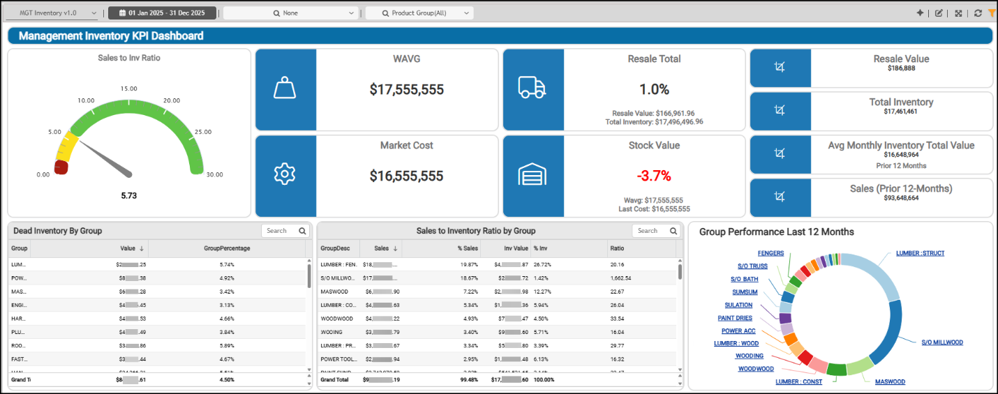
Average Monthly Inventory Total Value (Prior 12 Months) Widget (Management Inventory KPI Dashboard)
Widget Name: AVG INV Total v1.1
View Name: COG_VW_SalestoInventoryRation_v1.0
Historical: No (Static, Prior 12-Months)
Drill-Down: Yes
The Average Monthly Inventory Total Value headline widget shows the average monthly total average-cost inventory value over the prior 12-month period (excluding the current month and negative inventory values). We use the Stock Value records as the data source (including the monthly summary (the Day 0 records)) only. Then, we divide that amount by the average inventory value for the same period to calculate the total value for each month and the average for the 12 periods, to display this total. You can compare this value to the current total to determine whether the current inventory is above or below the average.
Management Inventory KPI Dashboard > Average Inventory Total Chart
The ratio indicates how frequently stock (inventory) turns over during the prior 12 months. High-turnover businesses, such as grocery stores, may have a ratio in the 20s on the high end. Most businesses are in the 8-12 range, but some with low-turnover businesses (who need to stock bulk quantities), such as with LBM dealers, may be in the 2-4 range. Generally, higher is better, but the evaluation of this range varies by the type of business you are running.
You can modify the dashboard settings to review this information by date range, branch, and by choosing specific product groups.
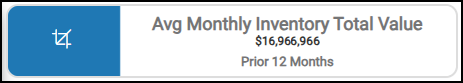
Dead Inventory by Group Widget
Widget Name: Dead inventory by Group v1.0
View Name: COG_VW_DeadInventorybyGroup
Historical: No
Drill-Down: Yes (Item SKU, Value)
The Dead Inventory by Group table widget provides insight into how much capital is tied up in stock that hasn’t sold or moved for a defined period—usually 6, 9, or 12 months. The product group descriptions show the total value of dead inventory for each product group and the percentage of that group's value it represents.
"Dead" is defined as a product that hasn't been sold in the past year (using the item’s last sold date). The table is sorted by total "dead" value in descending order using the inventory and stock value data. The Drill-Down tools provide a way to view the dead inventory by product and show its valuation in detail.
There can be many reasons this stock has not moved, which you can examine once you know it exists.
Management Inventory KPI Dashboard > Dead Inventory by Group Table
You can modify the dashboard settings to review stock at specific branches or limit your view to a specific group or a set of groups. You can also use the filter to use item descriptions.
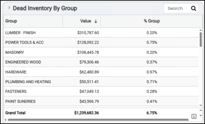
Group Performance in Last 12 Months Widget (Management Inventory KPI Dashboard)
Widget Name: Group Performance Last 12 Months v1.0
View Name: COG_VW_Salestoinventoryratiobygroup
Historical: No
Drill-Down: Yes (Group Description, Group #, Sales)
The Group Performance in the Last 12 Months circle widget helps you understand how each product group has performed financially over the last 12 months. This widget uses the same view as the Sales to Inventory Ratio by Group, but groups the results by total sales. This helps you evaluate which product groups are driving the most revenue, how performance compares year over year or seasonally, and whether any underperforming groups are tying up cash or warehouse space.
Management Inventory KPI Dashboard > Group Performance Last 12 Months Chart
If you click one of the links in the widget — for example, Electrical —you can see the details of that group’s sales revenue for the previous year.
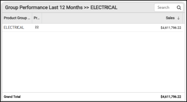
Management Inventory KPI Dashboard > Electrical Group Detail
You can review the group performance numbers together by selecting the Table option. This table also provides the grand total of sales for all groups for the last year.
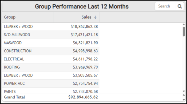
Management Inventory KPI Dashboard > Group Performance Last 12 Months Table
The AI Insights tabs for this widget might include:
-
Business Interpretation:
“Top Performing Product Groups: The <top product group name> group is the leading performer with total sales of <amount>. Following closely is <second product group> with <amount> in sales. These two groups significantly outperform all other categories, indicating their substantial contribution to the business's overall revenue.” -
Potential Business Decisions:
“Optimize High-Performance Segments: Investigate the specific factors driving the success of <top product group> and <second product group>. This could include analyzing sales strategies, customer segments (e.g., contractor accounts), inventory management, and pricing models that contribute to their outstanding performance. Replicate these successful practices in other relevant product groups.” -
Suggested Follow-Up Questions:
“What are the specific items that contribute most to sales within the <top product group> and <second product group>?”
You can change the date range and the branches used to collect this information, and click the links in the chart to provide details as shown above.
Market Cost Widget (Management Inventory KPI Dashboard)
Widget Name: Last Cost Stock Value v1.0
View Name: COG_VW_Stockvalue
Historical: No
Drill-Down: None
The Market Cost headline widget shows the total market cost of your current inventory. The application uses the stock value table records to define the market cost value. This table keeps records by year-month and day-of-month, with Day (0) containing the summary records. This value does not consider any negative on-hand inventory data.
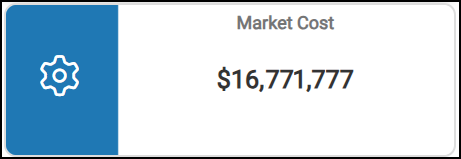
Management Inventory KPI Dashboard > Market Cost Chart
You can use the dashboard settings to change the date range of the valuation, the branch settings, and the group settings to review more details.
Resale Total Widget (Management Inventory KPI Dashboard)
Widget Name: Resale Total v1.0
View Name: COG_VW_ResaleTotal
Historical: No (Current values only)
Drill-Down: Yes (Product Group (summary), Item #, Item Description, Qty, and $ value) -All Inventory, not just resale.
The Resale Total headline widget shows the percentage of current resale inventory value compared to the total current inventory value. The Total Inventory value is the average cost value of the positive inventory items (On-Hand quantity > 0). The Resale items are typically special-order products returned after the original sale. The widget considers the branch settings and product group information in this calculation, but not the Dashboard date range setting.
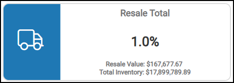
Management Inventory KPI Dashboard > Resale Total Chart
This widget also displays the resale value of the returned stock and the total inventory value. You can filter these results by changing the branch settings and the product groups evaluated in the dashboard settings.
Resale Value Widget (Management Inventory KPI Dashboard)
Widget Name: Resale Total v1.0
View Name: COG_VW_ResaleTotal
Historical: No (Current values only)
Drill-Down: None
The Resale Value headline widget calculates the total resale value of returned special order inventory. Typically, Resale item type values are set based on a special-ordered item’s original value (based on the original sale). This query uses the inventory tables rather than the stock value to calculate this value, which represents the average cost of the returned items.

Management Inventory KPI Dashboard > Resale Value Chart
You can use the Dashboard settings to change the results in this widget by adjusting the branch settings, the product group settings, the inventory resale information, the on-hand quantity data, and the cost values.
Sales (Prior 12 Months) Widget (Management Inventory KPI Dashboard)
Widget Name: Sales v1.1
View Name: COG_VW_SalestoInventoryRation_v1.0
Historical: No (Static, Prior 12-months only)
Drill-Down: None
The Sales (Prior 12 Months) headline widget shows total sales for the prior 12 months (excluding the current month and taxes). This widget uses the inventory stock value record Day 0 to collect the sales totals.
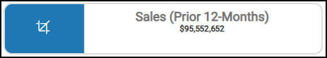
Management Inventory KPI Dashboard > Sales (Prior 12 Months) Widget
You can filter this data using the Dashboard settings of date range, branch, and product group, as well as cost settings.
Sales to Inventory Ratio (Overview) Widget (Management Inventory KPI Dashboard)
Widget Name: Sales to Inventory Ratio Gauge Chart v1.2
View Name: COG_VW_SalestoInventoryRation_v1.0
Historical: No
Drill-Down: None
The Sales-to-Inventory Ratio gauge widget measures how efficiently your company turns its inventory into sales. It can be a key performance metric for understanding inventory management, cash flow, and operational health.
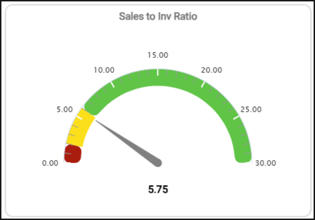
Management Inventory KPI Dashboard > Sales to Inventory Ratio Chart
This widget shows the sum of sales for the prior 12-month period and divides that amount by the average inventory value for the same period. This shows the average weighted cost for each product over the prior 12 months. This value does not average just the beginning and ending inventory, so it can better reflect seasonal impacts on the business. The data originates from the Stock Value table. This data can be filtered by branch. The colors used in this widget reflect the range settings:
-
High
-
Medium
-
Low
You can use this ratio to see how many times stock (inventory) turns over during the selected period. For high-turnover businesses, such as grocery stores, the ratio is on the high end at 20%. Most LBMH businesses are in the 8-12% range, but some with low turnover or a need to stock bulk quantities (in the case of dealers) can see percentages in the two to four range. In general, higher percentages are better, but this depends on the type of business you run.
You can filter this report by branch, date range, group code information, item data, inventory pricing data, sales, and total inventory evaluations.
Sales to Inventory Ratio by Group Widget (Management Inventory KPI Dashboard)
Widget Name: Sales to Inventory Ratio by Group
View Name: COG_VW_Salestoinventoryratiobygroup
Historical: No
Drill-Down: None
The Sales to Inventory Ratio by Group table widget provides the sales amount, the percent of total sales, the value, the percent of total value, and the sales-to-inventory ratio for each product group for the prior 12-month period (not including the current month). The 12-month rolling period is based on the current date. This widget is based on the Stock Value (Day 0) records, which determine the sales and value.
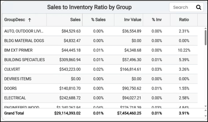
Management Inventory KPI Dashboard > Sales to Inventory Ratio by Group Table
The AI Insights tabs for this widget might include:
-
Business Interpretation:
“Highly Efficient Inventory Management in Special Order and Charge Categories: The highest sales-to-inventory ratios are observed in <first special order/charge category group> (<amount>), <second special order/charge category group> (<amount>), <third > (<amount>),<fourth special order category group> (<amount>), and <fifth special order category group> (<amount>). This indicates excellent inventory turnover, likely because these are special order items or charges that carry minimal to no inventory, maximizing capital efficiency by fulfilling customer demand without holding stock.” -
Potential Business Decisions:
“Optimize Inventory for Slow-Moving Categories: Initiate a detailed review of product groups with low sales-to-inventory ratios such as <last product group>, <second-to-last product group>, and <third-to-last product group>. Investigate the root causes of slow turnover, which could include overstocking, pricing issues, or decreased demand. Develop targeted strategies, such as promotional campaigns, strategic markdowns, or adjusted purchasing forecasts, to reduce excess inventory and improve capital utilization.” -
Suggested Follow-Up Questions:
“What are the sales and inventory values, along with the ratio, for all product groups that currently have an inventory value but have recorded zero sales?
You can change the data in this table by resetting the date range, the branches included in the evaluation, and the groups included in the metric.
Stock Value Widget (Management Inventory KPI Dashboard)
Widget Name: Stock Value v1.0
View Name: COG_VW_Stockvalue
Historical: No
Drill-Down: Yes
The Stock Value headline widget shows the percentage difference between the current inventory market cost and the average cost values.
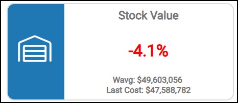
Management Inventory KPI Dashboard > Stock Value Chart
When the average cost valuation is less than the market cost valuation, the percentage is negative. The Market Cost can change based on either EDI processing updates (inventory receiving or price/cost updates) or manual updates, so this value can represent the product's replenishment costs.
Generally, when your average cost valuation is higher than your market cost valuation, it means that the average cost paid for inventory purchases in the past was higher than the current costs to replace that inventory. If reversed, and the average cost is the lower of the two values, replenishing inventory is trending to cost more than it has in the past. Assessing which value is higher may lead to decisions about which costs your company should use to base its product pricing on.
This widget displays the weighted-average cost of the inventory on hand and the most recent (Last) cost of that inventory.
You can change how this information is displayed by adjusting the Dashboard date range and the branches you are evaluating.
Total Inventory Widget (Management Inventory KPI Dashboard)
Widget Name: Total Inventory
View Name: COG_VW_ResaleTotal
Historical: No (Current values only)
Drill-Down: None
The Total Inventory widget shows the current value of all resale product groups' inventory (typically special-order products) across all included branches. This is essentially the resale value of the returned special order items you currently have in inventory. This query uses the inventory tables rather than stock value and is based on the same view as the "Resale Value" widget. This value reflects the average cost value.
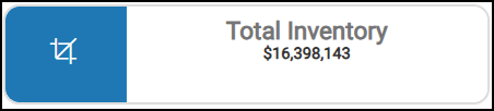
Management Inventory KPI Dashboard > Total Inventory Chart
You can revise this information by changing the date range, the branches included in the inventory evaluation, and the product groups used in the total inventory calculation.
Weighted Average Stock Value Widget (Management Inventory KPI Dashboard)
Widget Name: WAVG Stock Value v1.0
View Name: COG_VW_Stockvalue
Historical: No (Current values only)
Drill-Down: None
The Weighted Average Stock Value headline widget represents the current total average cost of your on-hand inventory. This widget shows records by year-month and day of the month, with the Day (0) containing the summary records. This chart excludes negative on-hand inventory and applies the branch (store) dashboard filters, but does not consider the product group.
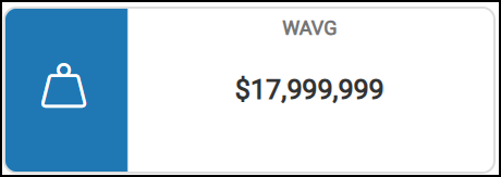
Management Inventory KPI Dashboard > Weighted-Average Stock Value Chart
You can apply filters for branches, date ranges, market value, stock value, and weighted-average calculations.
See Also:
Working with Cognytics Dashboards
Current Dashboard List