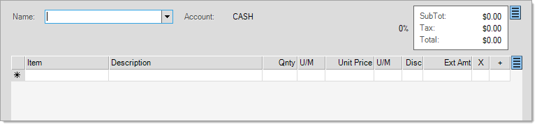
Data Grid
Many transactions include a grid for data entry. For those familiar with spreadsheet applications, such as Microsoft® Excel®, grid style entry will be familiar. For most grids, data is item related; however, data grids are also used for ledger accounts, receivables payments, and more. Regardless of their intended usage, the basic functionality of the grid remains the same. Since most users will be using a grid with items, most topics and examples will focus on grids that involve item entry.
Grid Structure
Each row (horizontal) represents the information about a specific item. The first row is for headings which identify the type of data in the columns and are also used for sorting. The columns and types of data displayed vary based on the needs of the transaction.
")
Data Grid (Item)
Just as when navigating a form, the data grid is comprised of both primary and secondary elements. When navigating through the data grid, some cells allow input (entry) and others are read-only (for informational purposes only). Read-only cells do not allow changes. Input cells provide some type of control such as a drop down or text input. Having the distinction between primary and secondary inputs adds efficiency during entry.
Primary
Primary columns are either required for entry (such as an item SKU) or involve data that typically would require user input (such as quantities). Primary columns will allow user input in almost all cases. These are accessed via TAB (forward) navigation through the grid. Primary columns are intended to be the most important fields for entry and selection. They represent the required information necessary for entry. These fields are assigned a TAB order so that users are placed in the fields during entry automatically.
Secondary
Secondary columns are not required for entry and involve data that is either less frequently modified or that may be read-only. Secondary cells can be accessed by clicking within the cell (or using SHIFT-TAB (backward) for keyboard access). Item descriptions are a common example of a secondary field.
Keyboard Navigation
Grids, like other areas, support keyboard use. Items are typically selected by their SKU (Stock Keeping Unit) or any alternate stock numbers that are set up, or scanned using a bar-code reader. After scanning, the keyboard is generally the fastest method for grid entry. For more detail about how keyboard entry functions within the data grid control, click here.
 and right
  arrow keys move the user from cell to cell (left and right) in a row.
 and down
  arrows move to cells vertically within the same column.
 on the keyboard/keypad perform the same function. In a form, the function of
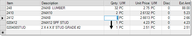
When a down arrow  button appears next to an input, it means that the field has some additional function (drop down selection, search feature, calendar, etc.). Click on the arrow button and see what happens!
Searching & Selecting
Primary fields, such as a drop down control, are often search-able and may offer a context menu with additional look-up options.
To search a primary field, enter a partial match then press return (or enter) key. Doing this will automatically generate a selection listing of anything that matches the starting text. The wild card (%) character is only supported in some cases.
The context menu on a drop down control may offer additional look-up functions. Fields valid for searching will offer options relevant to the expected input. For example, an item number field will only offer search functions that relate to items (inventory).

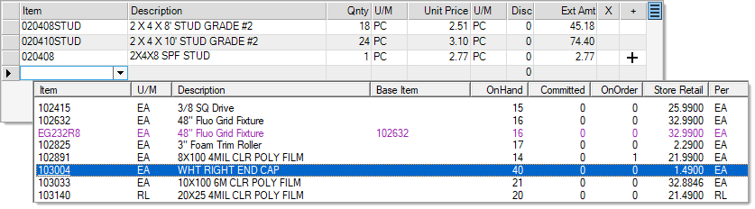
Item Selection by Keyword
Search options from an input are used with selection listings; however, there are also search options for use with items that have already been entered or copied into the grid (see below). These can be accessed from the context menu on the grid control (usually a right-click or by choosing the  windows menu key).

Search Data Grid
When searching the current data grid, you select the column you want to search using first. This opens a "search" dialog.
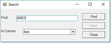
The "Find" text will default to the current row selection (if any). Change or enter the text as needed for the desired search a14nd choose "Find."
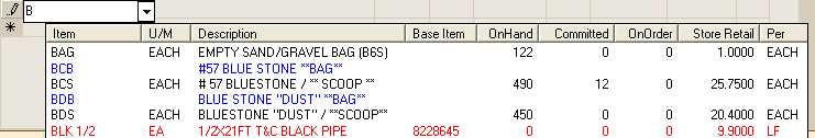
Color Coding in Item Selection Listings
When an item listing is displayed from the grid, users may notice various colors that appear. Item rows that are listed in red text are alternate stock codes assigned to another item. In this case, the "base item" displayed in the list is the actual item that is linked with the alternate SKU. Item rows listed in blue text are material lists. These items bring up a selection listing of either other items, comments, or both. Material lists often have no set price or require selection to calculate a price, so information regarding pricing is omitted. Quantities are not maintained for material lists either.
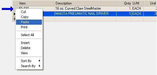
Row Options
When a user chooses the context menu from the row header column (the darker square blocks just to the left of the active grid area), different options are displayed. These allow the user to insert or remove lines, for example.
Resizing a Row
In addition, users can use the blocks on the heading row to re-size a row. This is useful when an item has a long description that isn't fully displayed in the grid.
To do this, hover the mouse between rows until a vertical line with arrows at both ends appears. Once this icon appears, click and drag up or down to re-size the row. Columns may not be re-sized. Clicking on a column heading temporarily sorts the column. No changes can be made while a grid is temporarily sorted. Pressing ESC (escape) cancels the sort and returns the grid to standard edit mode (for more information, see the topic Sorting a Grid).
Color Coding for Item Quantities
Color coding of quantities is used in item grids to indicate availability of stock. If an item has enough on-hand but the quantity entered in the grid exceeds the available (on-hand - committed), the quantity will appear in green text as a warning to the user. If the quantity entered in the grid exceeds the on-hand, the quantity will appear in red text instead. Black text indicates that the item is both in-stock and available.